
Testing Your Landing Page With Different Screen Sizes
As I build websites, I constantly have to check that the websites are compatible with the devices that they're going to be used on. For example, a big iMac, or an iPad or an iPhone. This is why responsive design is so cool nowadays.
First let me tell you why I'm posting this.
Responsive design lets you design one website and adjust its elements so that when the screen used to view the website is larger or smaller, the website reformats itself to fit that screen.
You should do this kind of testing when you're building landing pages too, but there is no need to do too much testing. Remember, done is better than perfect.
So as I mentioned in my previous post. Realfreewebsite.com was almost ready, but my buddy John said that I had to make it more personable. The stock photo wasn't going to cut it. I agreed with him for the most part, but last night I just had to get it done.
I'm using LeadPages to create my landing pages, and Leadpages takes care of the responsive design layouts. So I just needed some good photos instead of the stock photo I was using. Not that there's anything wrong with stock photos; they have its place but John was right on this one.
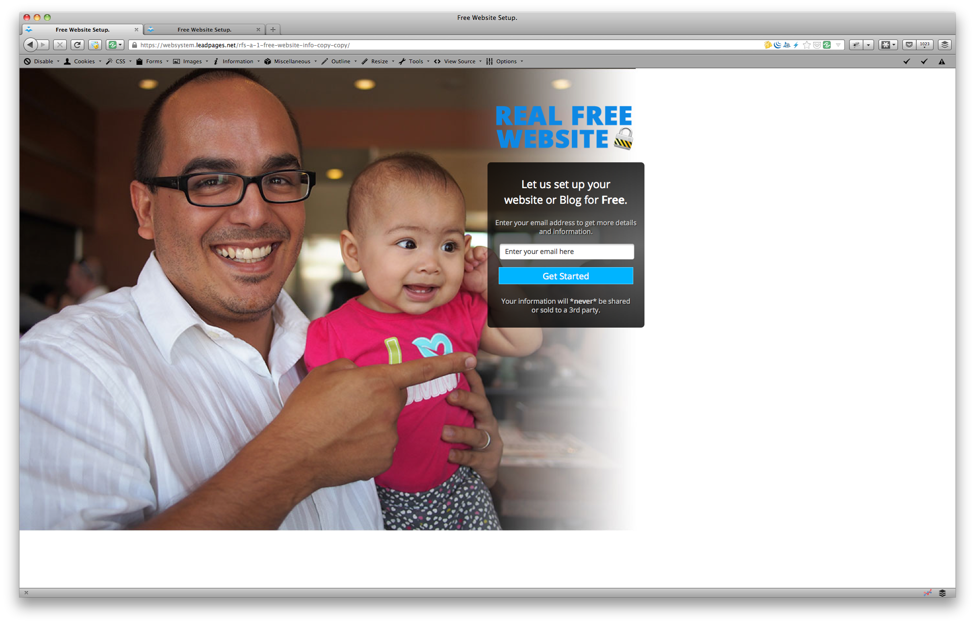
Today we went out to lunch and he snapped some photos with me and Claire and some of them came out really well. So I'm going to try using one of those now. Here's where the testing comes into play. Take a look at the first screenshot.
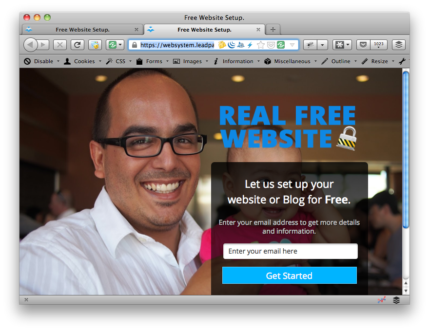
This was the full size image and so it didn't look really well. In fact it was kind of bad because Claire's face is blocked with the opt-in box and my finger never really points to the box... no matter what size screen I emulate.
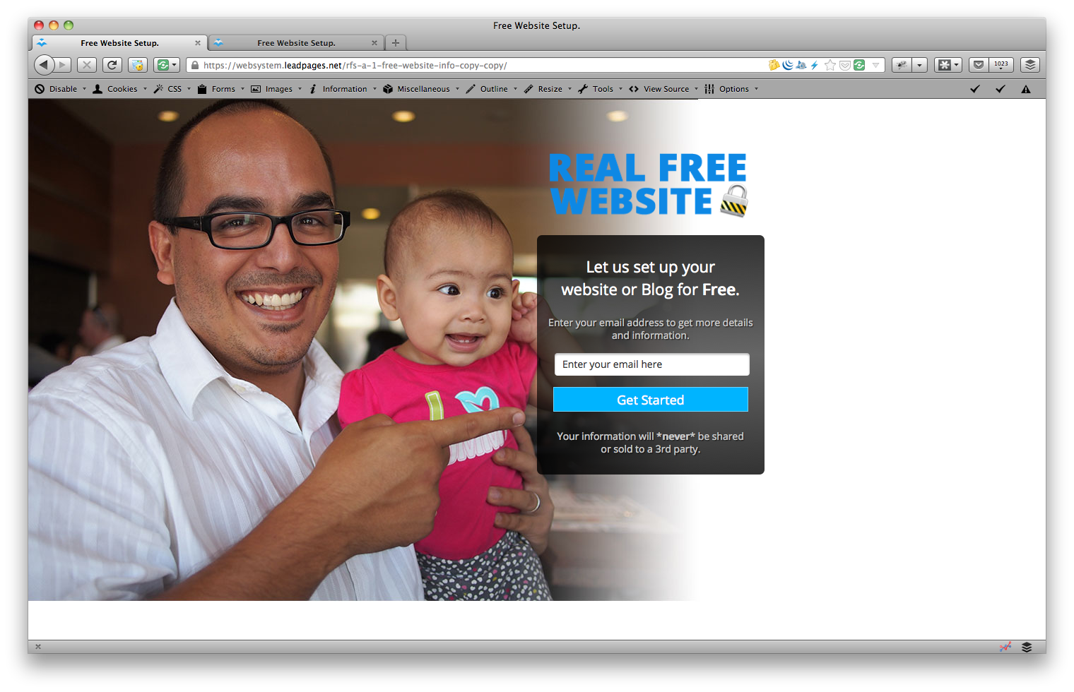
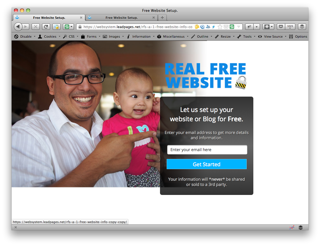
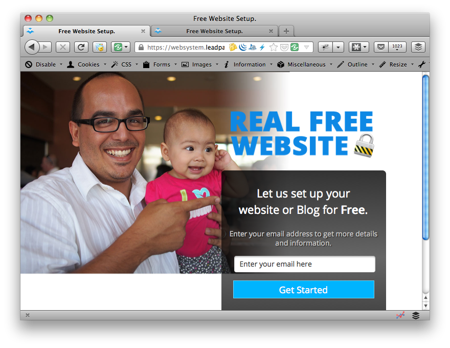
Even after I tried a few different sizes and the issue is still there. Too much blockage going on. Even though Leadpages is responsive, no amount of responsive design is going to compensate for an image that is the wrong size or has the subjects placed on the wrong side of the photo.
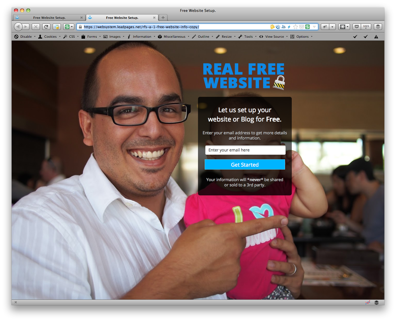
Notice the three other screenshots all resize and responsive design kicks in but the photo still doesn't fit quite right.
I needed the right photo first.

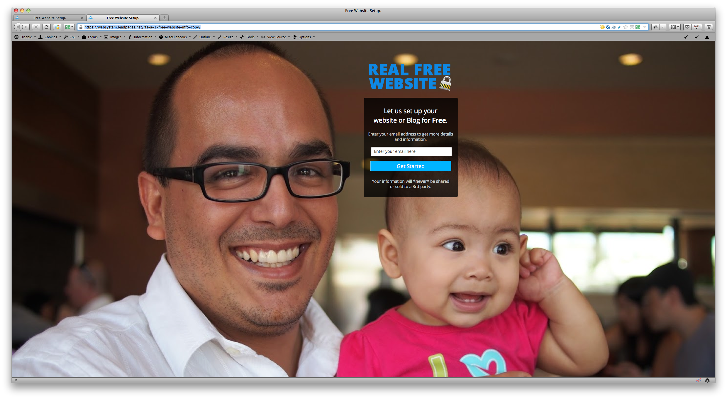
What I needed here was an image that had me and Claire positioned way towards the left. So I fired up photoshop and placed the image in a placeholder of the size suggested by LeadPages (1440x1100).
Then I added a thin white gradient to the right of Claire's arm to eliminate the hard border of the picture and voila. I had a wide photo with us on the left side and just white space on the right side.
I had to test it again. I uploaded it to my Leadpages landing page and it worked great. I still had to test it however, because when you have a 27 inch display you tend to forget that most people still have smaller screens.
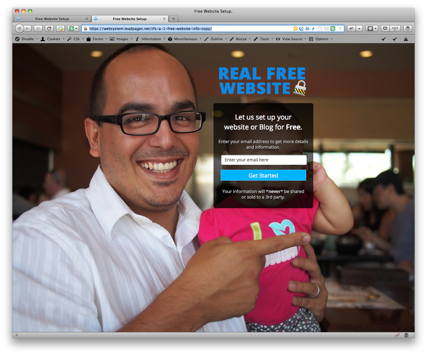
Check out the different screen sizes I tested with and how they all fit. Well, mostly. But this is good enough. Keep in mind some of these screenshots were bigger than they're shown in here but you still get to appreciate the dimensions and placement of the opt-in box, my face and Claire's face. I reduced them in size so that the page wouldn't take a month to load for you.

Most of the sizes fit and help me get the message across. I'm a real person, inviting you to get a free website. I'm still pointing to the box or pretty close to it and Claire is still visible in the picture. This should work!
Now, an easier way to test than by just resizing the window by hand.
There are several tools out there that help you resize your browser accurately. One of the ones I use quite a bit is called WebDeveloper Toolbar and it works with Firefox. It lets you create different sizes so that you can resize the window of your browser to the exact dimensions you need to test.
Using Webdeveloper is very convenient because with the resizer tool you can quickly switch between sizes and make sure you're still on target to build something that most of your audience will be able to use and enjoy.
If you want to install this, head over the the extensions repository for Firefox and search for Webdeveloper, then you can install it. Or you can find Webdeveloper Toolbar here. Once installed, it is easy to create new sizes for the resizer tool.
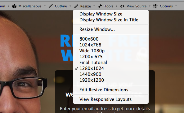
As you can see, I have many sizes already defined. You can create whatever size you want. But Webdeveloper goes one step further. If you notice on that dropdown menu, the very last option is an option to "View Responsive Dimensions." This is a really cool tool that will reload whatever page you're looking at but in a single browser window where you can scroll through and view all the most popular responsive layout sizes in one click.
But Webdeveloper does a whole lot more than just resize your window. You can debug your HTML code, test CSS, test links, play with cookies and other really advanced stuff. Don't let this scare you in your journey to make money online, it's nice to test sizes but not a requirement.
It's nice to be able to test window sizes when you're creating your first landing pages. Anyway, good luck and I hope this is helpful. You probably don't need this right away, but it's good to know because sooner or later you'll need something like Webdeveloper. Good luck!