My Site Revamped
I apologize for the outage over the past couple days. Apparently I installed a plugin that made my server crash. After talking to my awesome webhost Inmotion Hosting, they offered some help to resolve the issue.
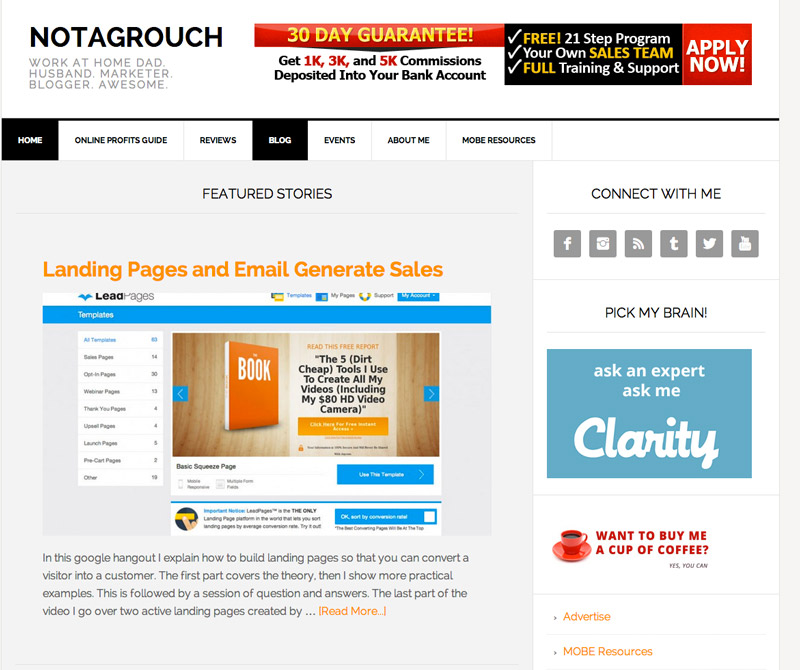
Almost 2 days later, I'm back on at full force, and Notagrouch.com has gone a full round of redesign. As you may know, my blog has gone through a couple of revisions over the past six months. I had tried the new Sixteen Nine Theme by StudioPress, I tried Customizr, I've tried a half dozen other free themes. But so far and from extensive experience, Genesis based themes are the best.

Sixteen Nine was really nice, but it wasn't suitable for my type of website. It is great for a regular blog but I need more "real estate" and so I went with News Pro, also a Genesis theme by Studiopress. I like it because it has a lot of different widget areas and it.
So what do I like about this new theme? The front page has several widgetized areas, for example the Featured section I made it show one "big" article and then 8 smaller articles underneath. For the front page and most pages I'm using a single sidebar layout, it's great because it gives the visitor great amount of whitespace and breathing room.
Something else I really like is the footer section. It has six widgetized areas and I'm using those for additional blogposts for specific categories, special menus and I may add some images and social media items there.
Additional changes I wanted to highlight to you are improved navigation, improved layouts and more relevant information on each section you visit on the site.
Better photo albums
I revamped my photo albums and will be adding new photos more regularly. Turns out that Nextgen gallery has improved quite a bit. Check out my Photo Albums Gallery.
Better and more accessible navigation
I changed the menus around a little bit to show you the most important sections of the site and I also placed the menus in the various sections where you will see them more easily. You'll notice there are navigation menus at the top of the site, in the footer and also a few on the sidebar.
Responsive goodness
Even though a responsive theme has been a requirement since I set out to find a new theme for my site, I'm glad to say that this theme is really slick and very good at shifting its content around to fit whatever device you're using. It's a very good thing to make sure your theme is also responsive, turns out that most of my visitors use a smaller screen, like an iPad mini. So I need to make sure my site loads well for them.
If you don't know what "responsive" means when it comes to a website, then open my site up on your desktop or laptop browser and then resize your browser window, you'll notice how everything gets shifted around to fit the size of the window. This is how the site is able to show in most people's browsers and everything fits well.