Jumping Into Brunch Pro by Studiopress
I've been using the News Pro theme from Genesis for quite some time now. I think it's time to evolve past it so I decided to jump to a new layout. I'm still using the Genesis framework, but this time I'm going to use the Brunch Pro theme.
I know I post foodie-type of items from time to time, but the focus of this blog is online marketing, business, and WordPress. One of the things with Genesis and the child themes from Studiopress is that they are designed for a specific purpose, but with a little creativity you can make any theme fit with any content.
But the Brunch Pro theme has some interesting layouts I want to use without having to spend a lot of time developing them myself the way I want them.
On the News Pro side of things, I have quite a few places where I need to save custom code from before I deactivate that theme and activate the new one.
I have quite a bit of custom CSS snippets throughout the site, so I'll try to keep all of them handy, so I can re-create them quickly, but I'm afraid I'll miss some anyway. We'll see how it goes.
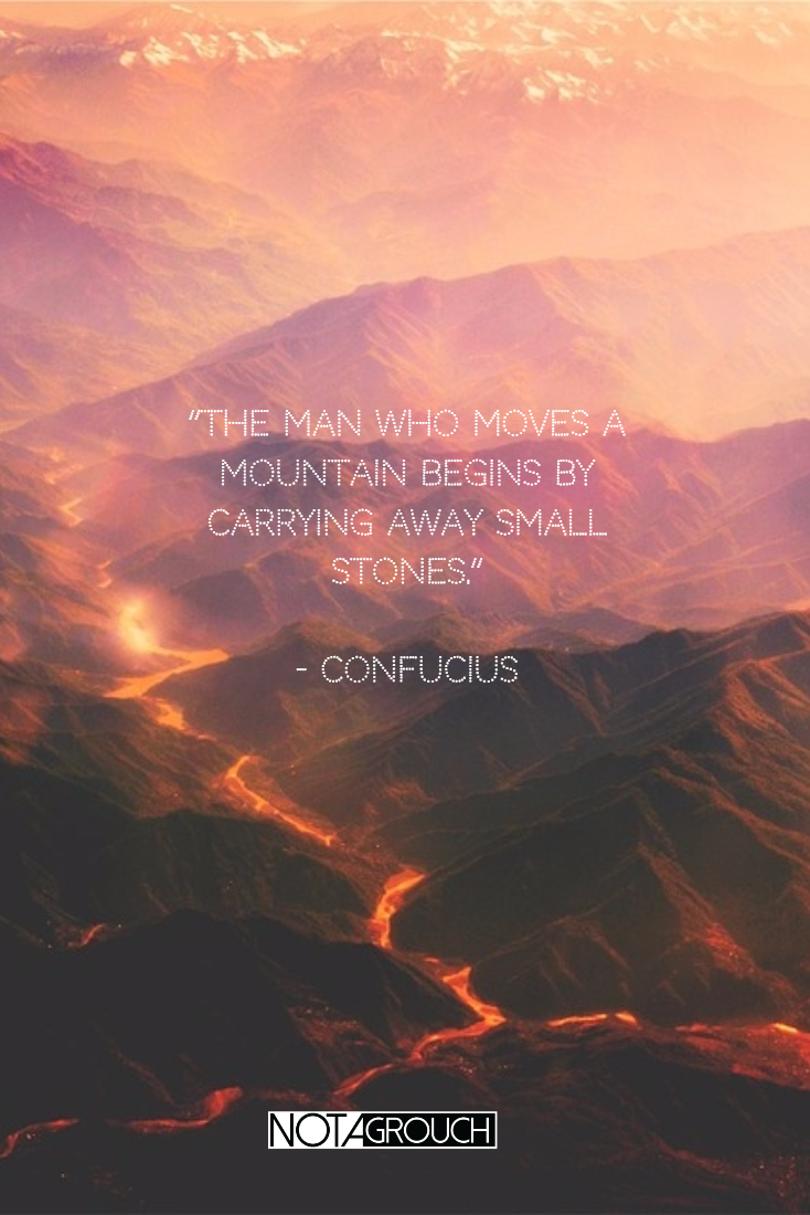
But if I don't make the jump, then I will never get it done. Now the featured image makes sense, no? Even if it's not perfect at first, I'll start moving the mountain, right?
The places I can think of that contain my custom code and snippets are listed below; maybe you're looking for something similar before you switch themes.
- Under the new Customizer under "Additional CSS."
- Under Appearance, Edit CSS.
- Under Appearance, Editor, and any number of files.
- Some of the files could be: custom.css, functions.php, styles.css, you could read the theme's documentation for full details.
If you're doing this like me, you may also find configuration options you should note under the Genesis & Theme Settings area.
If you're using a theme besides a Genesis or Genesis child-theme, you may need to read the documentation for your theme to see where else might there be a place that could contain custom code.
You'll be surprised how many things you can forget over time. I had forgotten a lot of these little changes I've made over time, like font size changes, some color adjustment changes, and then I also had forgotten how many miscellaneous tracking and other verification scripts I've used over time.
Why the change?
I've been a proponent of using images for the blog in a "wide" format. It's what I've always recommended and used. Things like the featured image and the main image. I think they should be wider instead of taller.
Taller instead of wider seems like a necessary change. I want to say it's a trend, but it isn't a design trend; instead, it is a response to the trend in consumer behavior with mobile devices.
Our eyes see things better in a side-to-side orientation. Like our TVs and Movie screens, even our windshields. But many people are now reading blogs and websites exclusively or mostly on their phones, so it makes sense to have tall images instead of just wide to deliver a better experience.
Instagram's interface is designed around a square image, even if they now allow portrait and landscape photos. But Snapchat, Facebook Messenger, and other apps that are used daily present their content in portrait mode (taller vs wider).
Many people are now reading blogs and websites exclusively or mostly on their phones, so it makes sense to have photos and graphics be taller now at least to test to see how it works. So my idea of how it should be may soon be replaced by the needs of doing mobile-first.
Mobile vs traditional screens
In the past, the first thing we designed for was the traditional display. The laptop or desktop screen, but now we have to think about our web design and our blogs living in a mobile era. I know people that can go a whole week or longer without using a personal computer (laptop or desktop) at home.
This was unheard of 10 years ago. But now, most people can do most of their "computing" needs directly from their mobile device.
I've been keeping up with the bare minimum lately and I maintained the blog in a way that was responsive, but I still had sidebars as an important area to deliver content from.
Now, the sidebars will still be there, but only in blog and content sections, where they make sense. The home page should be streamlined quite a bit so you will have an easier time finding things and browsing through the site.
Conclusion.
I am moving my site to a new theme, still powered by Genesis, because I love these guys but the underlying child-theme is changing to Brunch Pro. If you're going through a theme change, I also talked about some tips to follow when looking for areas where a theme may have custom code, scripts, or settings that you'll need to or want to save before you make the switch.